Deskbee's Design System
One hive,
every product.
The BeeHive is the honeycomb that connects brand, design and code. From the brand tokens to the App, Panel and Room Display: one decision, the whole product.
The BeeHive is the honeycomb that connects brand, design and code. From the brand tokens to the App, Panel and Room Display: one decision, the whole product.
Four beliefs we learned by building, not on paper.
Color, typography and spacing come from the same source. Change the origin and the whole product changes with it.
Every component in its place, with the right curve and weight. Easy to find, hard to get wrong.
From design to code with no noise. We brought the product's own design system here as a living foundation.
What we decide once spreads across every product. The brand grows without multiplying the effort.
Before the BeeHive, each product went its own way. These were the problems that led us to build a single system.
App, Panel and Room Display grew apart. The same button had three shapes and the brand blue changed from screen to screen.
Every new thing started from scratch. We spent time rebuilding what already existed somewhere else.
Colors and typography drifted between brand and product. The identity got lost in the details, screen after screen.
Each screen handled contrast and keyboard its own way, when it did at all. Nothing was guaranteed for those who need it most.
Changing something simple meant repeating the fix in many places. Maintenance only grew with the product.
There was no single, reliable place. Design and code diverged, and no one knew which was right.
Five principles guide the design of every Deskbee product, distilled from the best design systems in the world.
Every element has a reason to exist. Color communicates: red is error, green is success. Nothing decorative without a function.
The same component behaves the same way in any product. You learn it once and use it everywhere.
AA/AAA contrast, screen reader support, keyboard navigation and visible focus in every component. Color is never the only indicator of state. Accessible isn't an extra, it's the foundation.
Color with meaning, spacing with purpose and typography that guides the eye. The right information always stands out.
Components solve real problems for the people who use Deskbee. Clarity and speed over decoration.
Beyond good-looking screens, a system that speeds up the team and protects the experience of whoever uses it.
Contrast, keyboard navigation and visible focus come built into every component. It stops being rework per screen and becomes the standard.
The same button, table and form in the App, the Panel and the Room Display. You don't relearn the interface for each product.
Screens assembled from ready, tested pieces. Less code, fewer bugs and new features arriving sooner.
A change is born at the source and propagates everywhere. The brand evolves without multiplying the effort.
The layered architecture prepares dark mode and per-client customization without retouching each screen.
Fixed in one place, fixed everywhere. The documentation uses the real components: what you see is what runs.
A preview of how we're building each product, with the choices behind every interface.
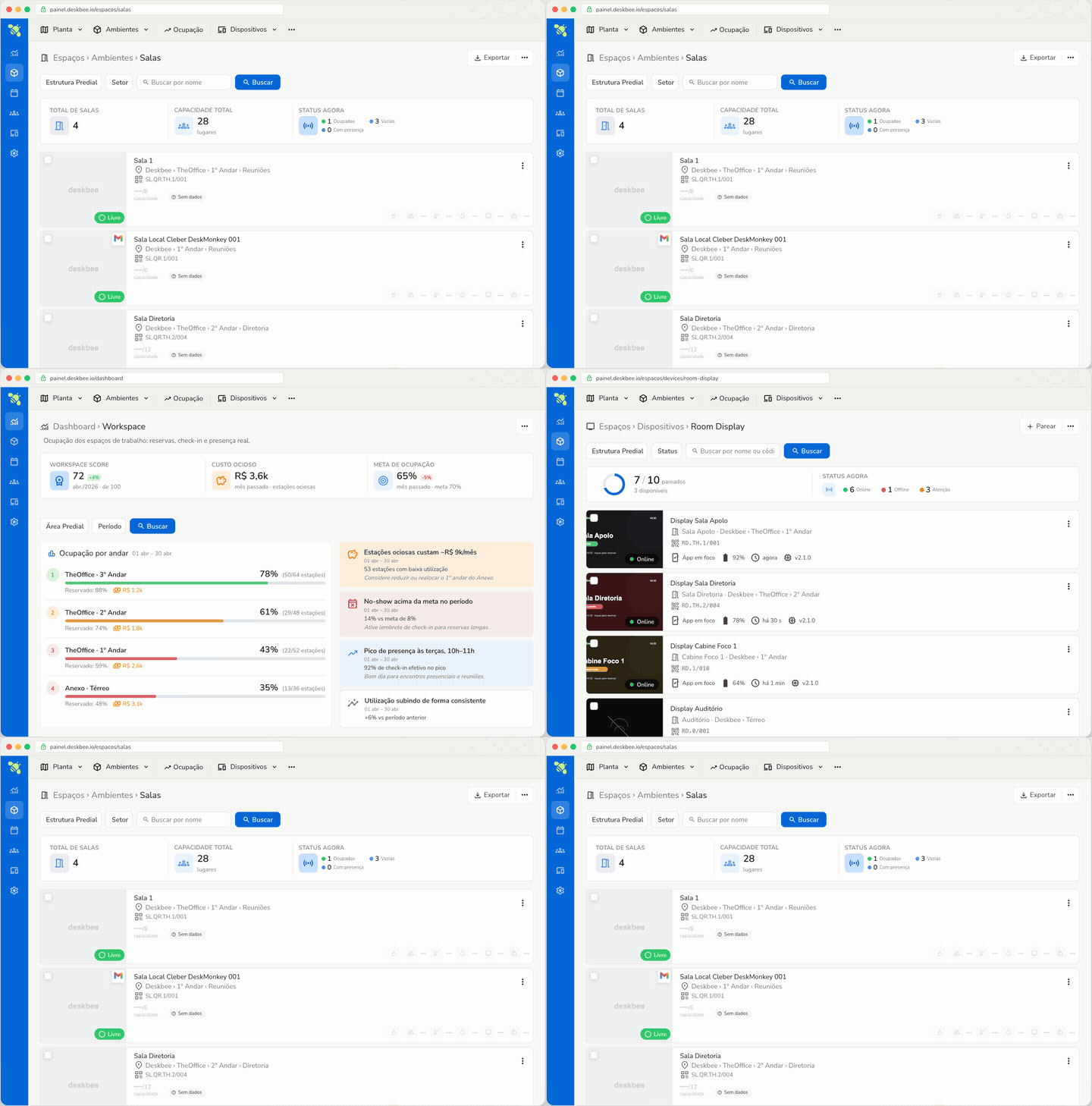
Spaces, occupancy and devices in a single view, with live status. Every list already carries the essentials to decide without opening ten screens.

People instantly see if the room is free, book it in seconds, and an empty room releases itself. Fewer missed meetings, fewer ghost rooms, less friction.
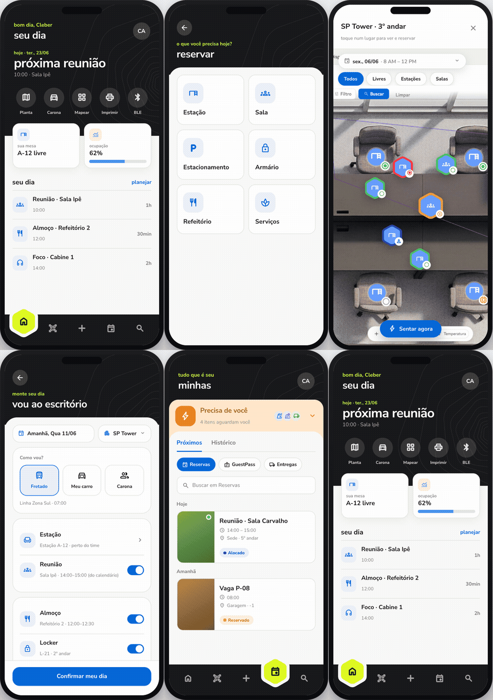
Deskbee's new native app brings bookings, space management and carpooling into a single experience. Everything about your day in the palm of your hand, without switching apps.
In the journal, JEDI shares how we build the BeeHive, our processes and the decisions behind the products you use.